6 Website Accessibility Checklists to Boost Website UX
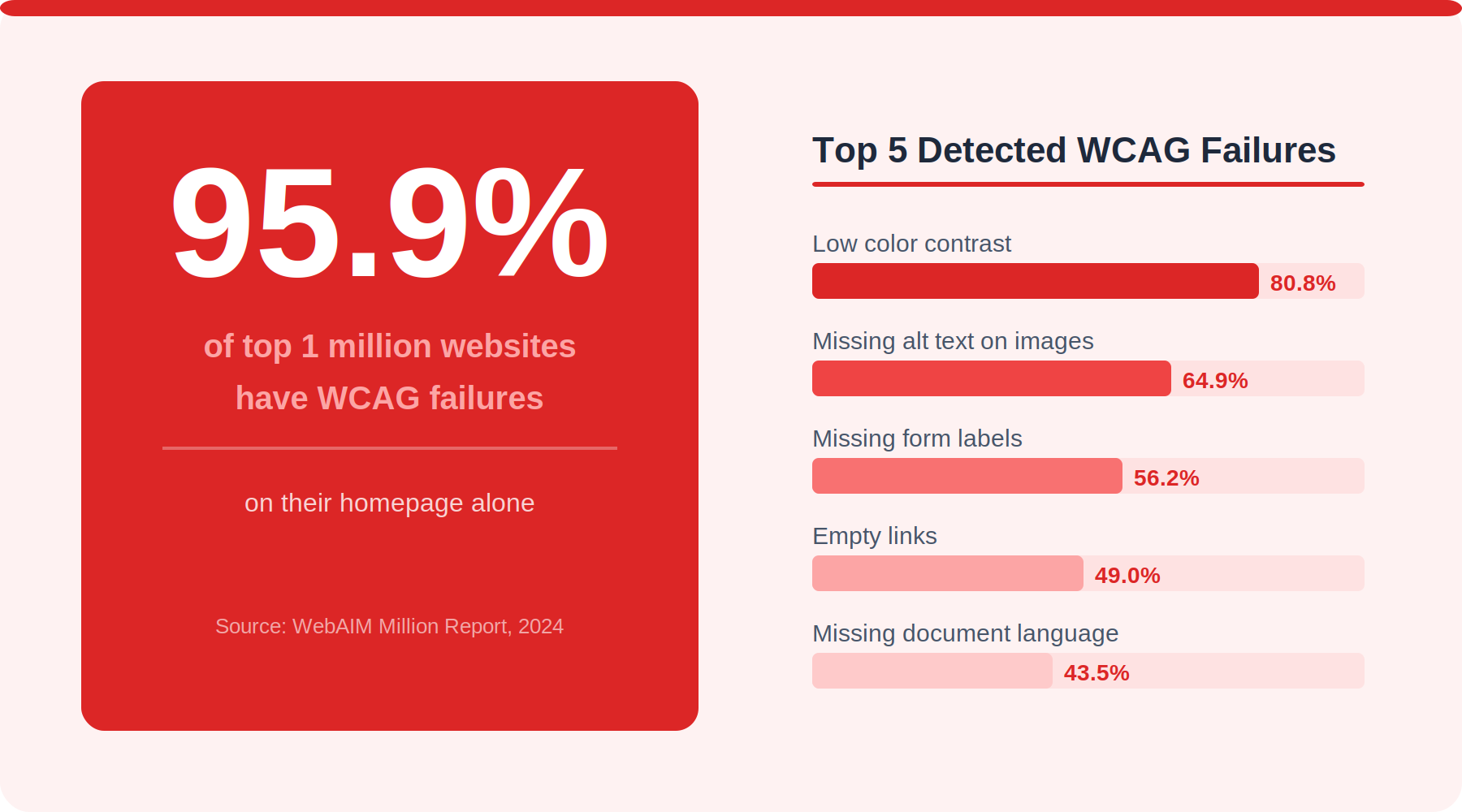
Around 1.3 billion! That’s the number of people worldwide who live with some form of disability. That’s 16% of the global population. Clearly, they too browse the web every day. Still, the WebAIM Million 2024 study found that 95.9% of the top one million websites had WCAG problems that could be seen on their home page. Even in six years, that number hasn't changed much.
If your site is like most of them, you're not just failing people. You're losing visitors, putting yourself at risk of being sued, and missing out on sales. That gap is filled by a website accessibility checklist. Your team can use this structured method over and over to find and fix hurdles before they become problems.
This guide walks you through six different checklists, each one for a different part of your site. Read them in order, or skip to the one that gives your site the most trouble.
What Is a Website Accessibility Checklist?
A website accessibility checklist is an organized list of questions that are used to see if a website can be used by people who have problems with hearing, seeing, moving, thinking, speaking or other disabilities. The World Wide Web Consortium (W3C) puts out the "Web Content Accessibility Guidelines" (WCAG), where each item on the list corresponds to a different set of rules.
The check list is not a one-time tool for auditing. At different times during a project, your designers, developers, and QA testers should look at it: during the design review, during development, before launch, and sometimes after.
Why a Website Accessibility Checklist Matters for UX, SEO, and Compliance
The case for accessibility does not rest on one argument but four.
Area of Benefit
What Accessibility Improves
Tangible Impact
User Experience
Removes friction for all users, not just those with disabilities
Lower bounce rate
SEO
Alt text, semantic HTML, and logical heading hierarchy all feed search crawlers
Better crawlability, richer indexing
Legal Compliance
ADA compliance, Section 508, EAA (EU), and EN 301 549 reference WCAG
Reduces lawsuit risk and regulatory penalties
Brand Reputation
Signals inclusive design values to customers
Stronger loyalty from a broader audience
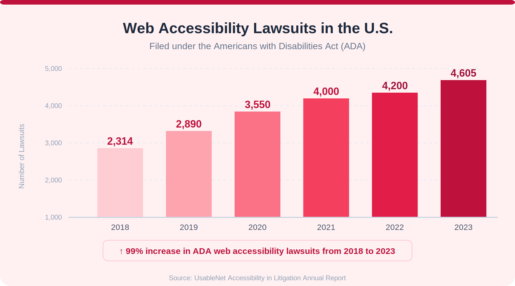
In the US alone, there were more than 4,600 cases about web accessibility in 2023, up from less than 2,300 in 2018. It's no longer a neutral choice to ignore accessibility.
Top 6 Website Accessibility Checklists
1. Website Accessibility Checklist for Text Alternatives and Alt Text
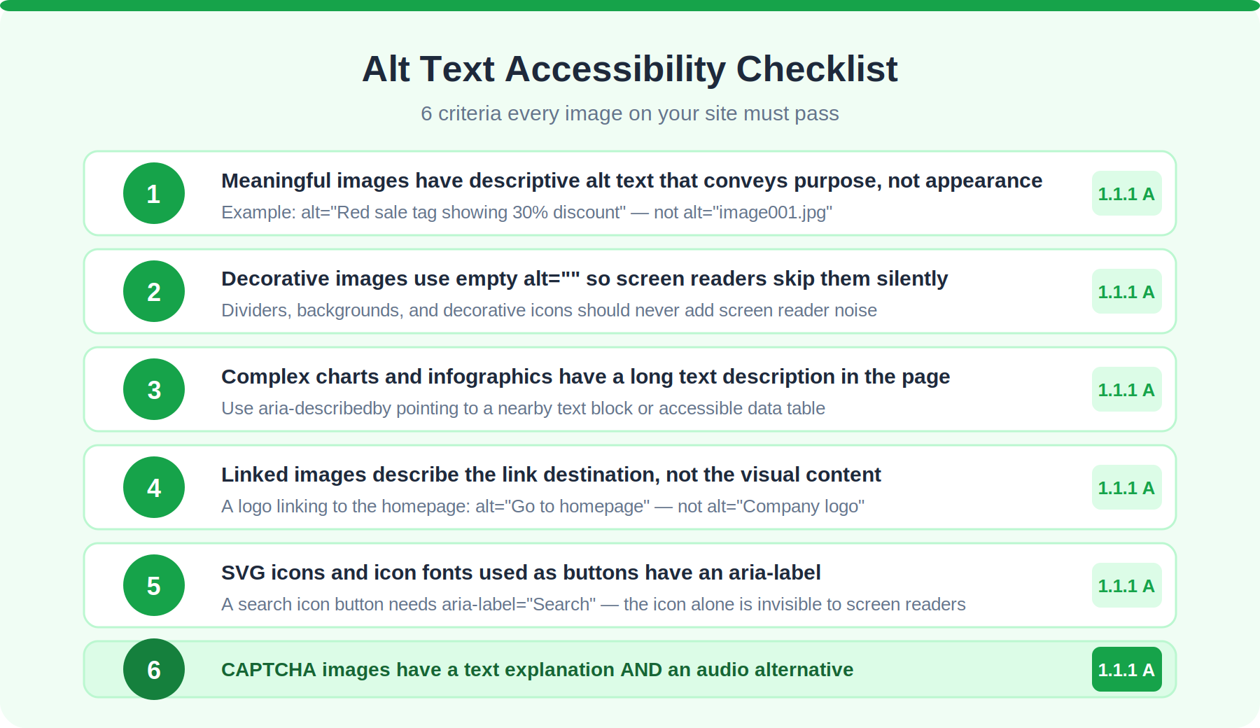
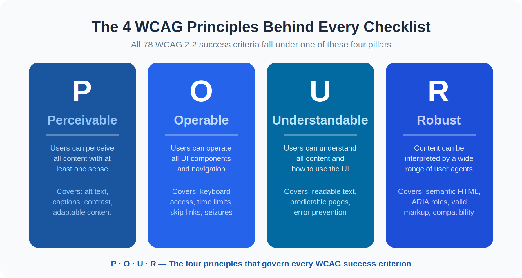
This checklist covers WCAG Principle 1: Perceivable. Anything that isn't text needs a text alternative so that it can be turned into a version that people can use, like speech, large print, braille, or symbols.
#
Checklist Item
WCAG Criterion
1.1
Every meaningful image has a descriptive alt text attribute that tells you what the image is for, not how it looks
1.1.1 (A)
1.2
Images that are just for looks have an empty alt property (alt=""), so screen reader support can skip them.
1.1.1 (A)
1.3
Charts and diagrams, for example, have a long explanation next to them or through aria-describedby.
1.1.1 (A)
1.4
Linked images tell you where to go, not the picture itself (for example, "Go to pricing page," not "Arrow").
1.1.1 (A)
1.5
Icon fonts or SVG icons that are used as buttons have a label that can be seen through aria-label or text that is clearly hidden.
1.1.1 (A)
1.6
There is a written version of CAPTCHA images that explains what they do, as well as an audio version.
1.1.1 (A)
One thing that most teams forget is to add alt text to pictures that are linked to. The alt text should say where the link leads, not what the picture looks like. A screen reader user can't use a linked logo that just says "company logo". But "Go to the home page" is not.
2. Website Accessibility Checklist for Keyboard Access and Navigation
Some users, like those who have motor disabilities or who just don't like using a mouse, rely on "keyboard navigation" alone. This list will make sure that they can get to and use all of your interface's features.
#
Checklist Item
WCAG Criterion
2.1
All interactive parts (buttons, links, forms, and "accessible menus") can be reached and used with just the keyboard.
2.1.1 (A)
2.2
Attention never gets stuck in a part unless it's a modal, and even then, pressing Escape should stop it.
2.1.2 (A)
2.3
At all times, focus indicators can be seen. The usual browser outline is only taken away if something else is added that is easy to see.
2.4.7 (AA), 2.4.11 (AA) WCAG 2.2
2.4
The first thing that can be focused on every page is a skip link, which lets computer users skip over headers that are shown more than once.
2.4.1 (A)
2.5
Tab order goes with the page's logical reading order, not the DOM order by mistake.
2.4.3 (A)
2.6
Accessible menus that drop down and fly out can be fully used with the arrow keys and collapsed with the Escape key.
2.1.1 (A)
2.7
No content requires a dragging motion as the only way to operate it (“WCAG 2.2” addition)
2.5.7 (AA)
Focus Appearance (2.4.11) was introduced as a new AA requirement in WCAG 2.2, which came out in 2023. It goes further than Focus Visible by saying what the minimum contrast and size should be for focus indicators. A lot of teams still don't know this exists.
3. Website Accessibility Checklist for Color Contrast and Readability
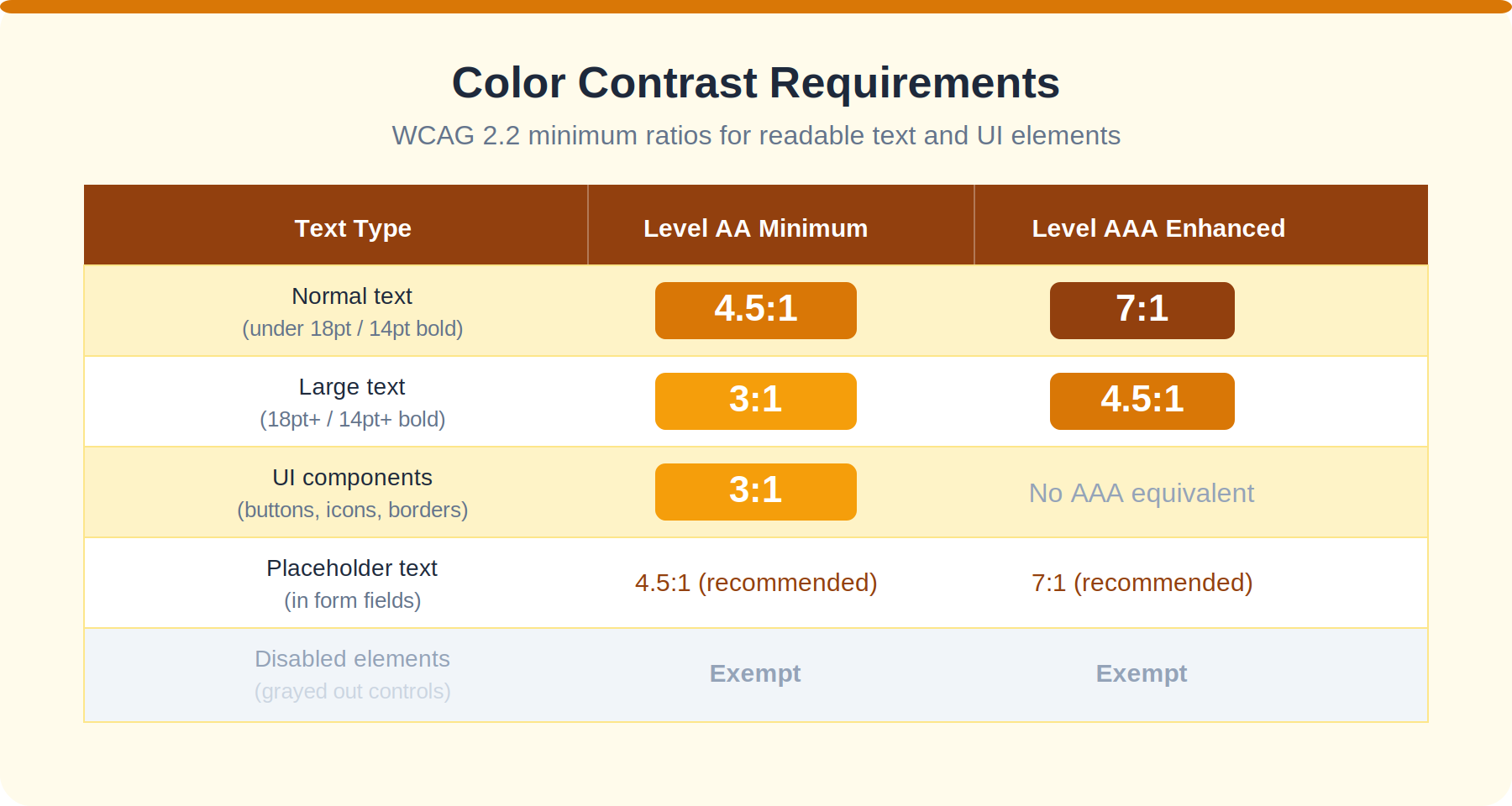
Color contrast is the WCAG error that happens most often on the web. The WebAIM Million 2024 study said that 80.8% of homepages had text that was hard to read. One of the most important accessibility changes you can make is to get this right.
Text Type
Minimum Contrast (AA)
Enhanced Contrast (AAA)
Normal text (under 18pt or 14pt bold)
4.5:1
7:1
Large text (18pt+ or 14pt+ bold)
3:1
4.5:1
UI components and graphical objects
3:1
No AAA equivalent
Placeholder text in form fields
4.5:1 (recommended)
7:1 (recommended)
Disabled elements
Exempt from requirements
Exempt from requirements
#
Checklist Item
WCAG Criterion
3.1
For every inch of text against the background, there is 4.5 times as much color contrast
1.4.3 (AA)
3.2
A 3:1 color contrast ratio is used for large sizes of text.
1.4.3 (AA)
3.3
Interactive UI features like buttons, input borders, and focus indicators are 3 times as bright as the colors next to them.
1.4.11 (AA)
3.4
Always use more than one way to communicate, like adding an icon or name to a red error message
1.4.1 (A)
3.5
No content or usefulness is lost when you "zoom to 200%" text.
1.4.4 (AA)
3.6
Fonts that can be read have line height that is at least 1.5 times the font size and letter spacing that is at least 0.12 times the font size.
1.4.12 (AA)
4. Website Accessibility Checklist for Forms, Labels, and Error Prevention
Forms are where most people get stuck, even on their own. Everyone gets annoyed by poorly labeled areas, confusing error messages, and session timeouts. If a form is broken, a service can't be used at all by people who depend on "screen reader support" or voice control software.
#
Checklist Item
WCAG Criterion
4.1
Every form field has a name that can be seen and is programmatically linked to it using the <label> element or aria-labelledby.
1.3.1 (A), 3.3.2 (AA)
4.2
It is not possible to use placeholder text instead of a name. When you focus on a placeholder, it disappears, taking away the field directions
3.3.2 (AA)
4.3
There are more ways than just color to show an error message, like using an icon, writing, and red underlining.
3.3.1 (A), 3.3.3 (AA)
4.4
When there is an error, the message tells you which field is broken and what went wrong in simple terms.
1.4.1 (A)
4.5
Required fields are marked clearly before you submit, not just after you make a mistake.
3.3.2 (AA)
4.6
As part of input assistance, users can look over, fix, and check their input before sending it as a final submission for important transactions.
3.3.4 (AA)
4.7
For accessible forms to work, input fields must have the right autocomplete property (for example, autocomplete='email').
1.3.5 (AA)
Tip: Remember to test your accessible forms with your screen closed and VoiceOver (macOS) or NVDA (Windows) on. You probably can't fill out the form without looking, which means that people who are blind or have low vision are probably having trouble too, but you haven't noticed it yet.
5. Website Accessibility Checklist for Multimedia, Motion, and Time Limits
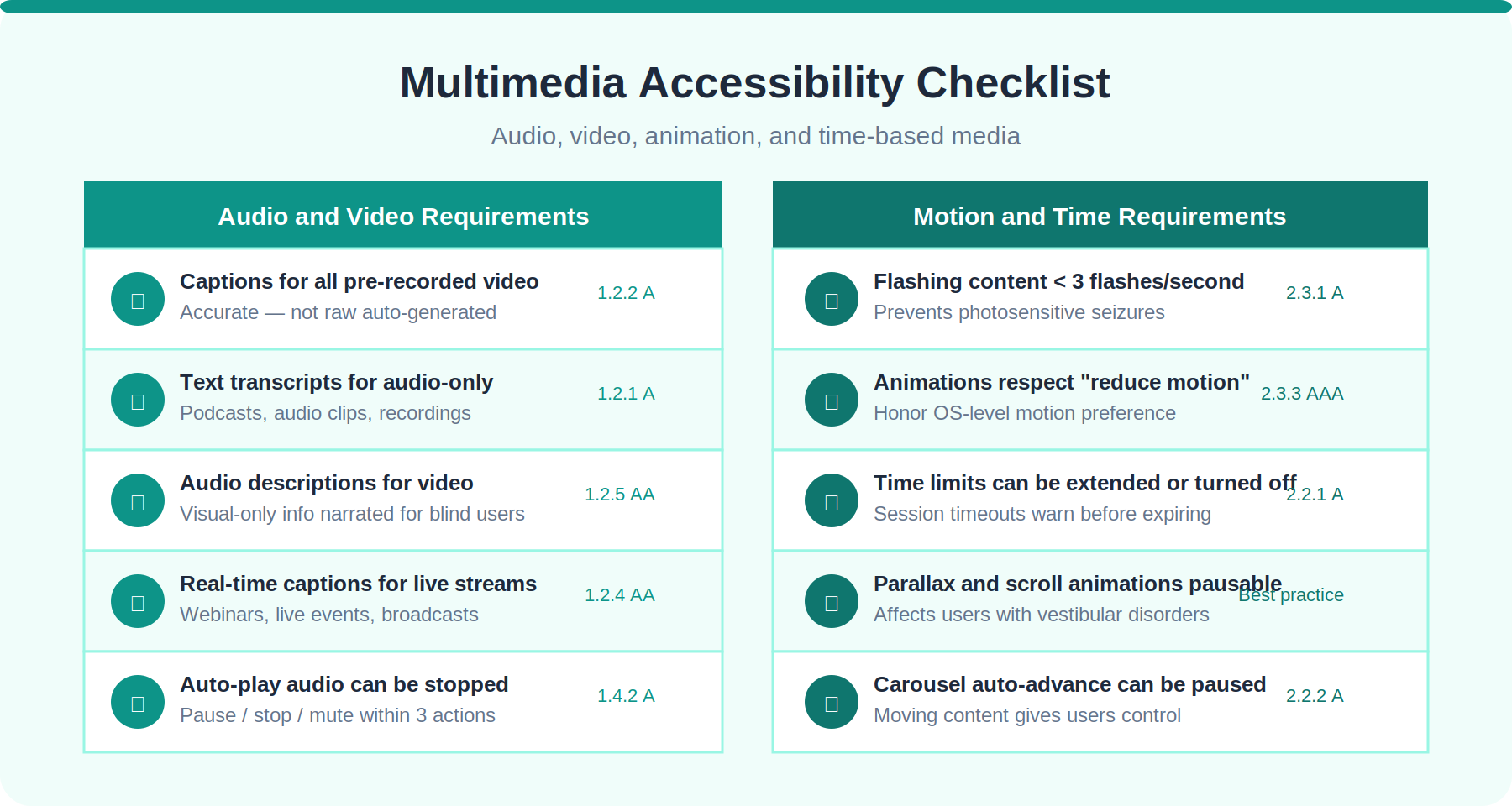
Audio and video material can be hard for people who are deaf or hard of hearing, who work in noisy places, or who don't speak English as their first language. Users with vestibular disorders, cognitive disabilities, or those who need more time to process information have trouble with autoplay, animation, and time limits.
#
Checklist Item
WCAG Criterion
5.1
Synced captions that are correct are included with pre-recorded video; they are not automatically produced without review.
1.2.2 (A)
5.2
Audio content that has already been recorded has written transcripts.
1.2.1 (A)
5.3
Pre-recorded videos have voice descriptions or full transcripts for information that can only be seen.
1.2.3 (A), 1.2.5 (AA)
5.4
Captions are shown in real time for live speech or video.
1.2.4 (AA)
5.5
Auto-playing sound can be stopped or muted within three clicks (pause, stop, and hide) from the page's beginning.
1.4.2 (A)
5.6
The reduce motion setting on the OS or an option on the site can be used to turn off animations. This makes it easier to handle content that flashes.
2.3.3 (AAA) / Best practice at AA
5.7
There is a warning before a time limit expires and a way to lengthen or turn it off, unless the limit is necessary.
2.2.1 (A)
5.8
To keep flashing material from causing seizures, nothing on the page flashes more than three times per second.
2.3.1 (A)
How WCAG 2.2 Supports Your Website Accessibility Checklist
That same month, in October 2023, WCAG 2.2 was made an official W3C suggestion. Nine new success factors were added, and one old one (4.1.1 Parsing) was taken away. These are the features that are most useful for design and development work.
Success Criterion
Level
What It Requires
2.4.11 Focus Appearance
AA
Focus indicators need to be able to show at least a third of the screen's area and not be completely hidden by other material.
2.4.12 Focus Appearance (Enhanced)
AAA
Tougher rules on the area and contrast of focus markers
2.4.13 Focus Appearance
AA
The part that is getting attention can't be completely hidden.
2.5.7 Dragging Movements
AA
Any move that needs to be dragged must also be possible with a single pointer.
2.5.8 Target Size (Minimum)
AA
Interactive targets need to be at least 24x24 CSS pixels big or far enough away from other targets to be usable.
3.2.6 Consistent Help
A
Help buttons (such as chat, phone, and FAQ) must be placed in the same place on every page.
3.3.7 Redundant Entry
A
As part of input help, users shouldn't have to enter information again that they already gave during the same session.
3.3.8 Accessible Authentication
AA
Cognitive function tests, such as copying skewed text, shouldn't be needed for login.
Accessible Web Design Best Practices to Support Compliance
Conformance levels are reached only when you finish a task. A good accessible web design goes even further and makes websites that people enjoy using. Some things that really make a difference:
Use Semantic HTML First, ARIA Roles Second
A native HTML button can be reached with a keyboard, can be focused, and is marked properly by screen reader support right out of the box. Until you add role, tabindex, and input event handlers by hand, a div that looks like a button is none of those things. ARIA roles fill in the blanks where semantic HTML falls short, but they shouldn't be used instead of it.
Structure Headings with a Clear Heading Hierarchy
There should be one H1 on every page. The headings below it should make sense (H2, then H3 under it, etc.) and not jump levels. This heading hierarchy is important because people who use screen readers often jump from one heading to the next. If your heading hierarchy is broken, it's like not having chapter numbers in a book.
Design for Zoom to 200% from the Start
Zoom in 200% on any browser. You have a WCAG 1.4.4 failure if your layout breaks, content hides behind other elements, or a horizontal scrollbar shows up on a page that doesn't have any data. Fluid layouts and responsive design handle zoom well. Containers with a fixed width don't.
Write Error Messages That Actually Help
An error message that says invalid input is not helpful. Your email address must have a @ symbol. Specific error messages that can be fixed help users with cognitive disabilities who need clear field instructions to fix their mistakes and keep them from abandoning the form.
How to Test and Maintain Your Website Accessibility Checklist
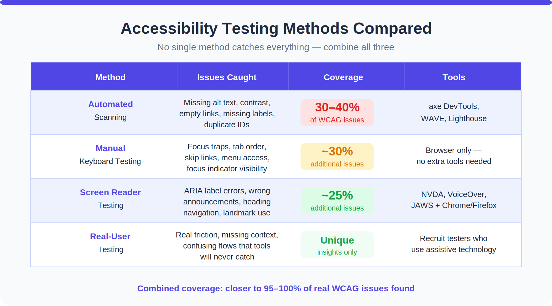
There is no one way to test that can catch everything. About 30% to 40% of WCAG problems are missed by automated accessibility testing tools. To get effective coverage, testing must be done by hand and with assistive technology on real people.
Testing Method
What It Catches
Tools
Automated accessibility testing
Not enough alt text, bad color contrast, missing form marks, and links that don't lead anywhere
axe DevTools, WAVE, Lighthouse, Deque
Manual keyboard testing
Focus traps, broken tab order, options that can't be reached, and skip links
Browser only, no extra tools needed
Screen reader testing
Announcements that were wrong, ARIA job labels that were missing, and a confusing heading hierarchy
NVDA + Firefox, VoiceOver + Safari, JAWS + Chrome
Zoom and reflow testing
When zoomed in to 200%, the layout breaks, information is hidden or overlaps, and functionality is lost.
Browser zoom, Chrome DevTools
Color contrast analysis
Problems with color contrast in text and UI elements
Colour Contrast Analyser (free), axe
Real-user testing
Problems with usability that tools can't find, and friction in the real world
Recruit users with disabilities for testing sessions
A lot of the time, maintenance is more important than the original accessibility audit. New code that is sent out without being reviewed can make things less accessible. Use tools like axe-core to add accessibility checks to your CI/CD workflow. At least once a year, or whenever a big redesign comes out, set up a full session for manual accessibility testing.
An effective remediation plan lists all the problems, who is responsible for them, when they need to be fixed, and how far along the process is. The accessibility audit is just a list without it, and no one does anything with it.
Frequently Asked Questions
My developer says the site passes Lighthouse. Does that mean we're accessible?
About 30 to 40 percent of WCAG fails are caught by Lighthouse and other automated accessibility testing tools. It's a good start to pass a scan, but that doesn't mean you can get to everything. You still need to test the keyboard by hand, test the screen reader, and ideally have meetings with real people who use assistive technology. A word checker is what automated accessibility testing is like. It's not a full editor.
Which WCAG conformance levels should we target: A, AA, or AAA?
WCAG 2.2 Level AA is the right goal for most businesses. It is the level that the Americans with Disabilities Act (ADA), Section 508, the European Accessibility Act, and most other legal systems use to describe compliance. Level A only talks about the most important hurdles. Some of the requirements for Level AAA can't be met by all kinds of content, so the W3C doesn't think it should be a policy-wide conformance level.
We have hundreds of images. How do we prioritize alt text fixes?
Start with images that have value, like pictures of products, infographics, charts, and pictures that are inside of buttons or links. With an empty alt attribute, it's easy to fix decorative pictures, and they can often be batch-processed. Images that are set as backgrounds in CSS don't need alt text. Run an automatic accessibility test with axe or WAVE to get a full list that is sorted by how it affects people.
What is the minimum touch target size for mobile accessibility?
For dynamic targets, WCAG 2.2 says that they must be at least 24x24 CSS pixels. For mobile accessibility, the older WCAG 2.5.5 (AAA) suggests 44x44 pixels, which is still the better goal. In their own design standards, both Apple and Google say that the size should be at least 44x44 pixels.
Do videos need captions even if they are short social media clips?
WCAG says that all pre-recorded synced media, no matter how long it is, must have captions. A 15-second teaser video for a product that doesn't have words is a Level A fail. Auto-generated captions only count if they are checked for correctness and then approved. Raw comments made by AI often have enough mistakes to really bother people who depend on them.
How do I write useful alt text for a chart or graph?
The alt text for a chart should not only describe the type of chart, but also give the main idea. "Bar chart" is not a good alternative for a bar chart that shows Q3 sales by area. You could use "bar chart showing Q3 sales by region" as an example of alt text. With 42% of all sales, the Northeast was in first place."If the data is complicated, give the whole set as an easy-to-read table below the image."
What is accessible web design, and how is it different from standard web design?
Accessible web design uses the same basic ideas as regular web design, but from the very beginning, it thinks about how to make the site accessible to everyone. That means picking colors with enough contrast, writing semantic HTML, making interfaces that are easy to use with a keyboard, and trying with a screen reader before launch. The most important difference is that mobility is seen as a must, not an extra.
How often should we run an accessibility audit?
Use a tool that is built into your pipeline to do automated accessibility testing on every release. Do a full accessibility check by hand at least once a year and every time there is a major redesign, new feature, or CMS platform change. It's normal for accessibility to get worse after big updates, so make it a habit to check before merging new code.
Our budget is small. Which checklist should we start with?
Start with color contrast and alt text. These two areas account for a large share of all WCAG failures and can be fixed relatively quickly. Color contrast issues can often be caught and corrected entirely within your design files before any development work happens. Alt text can be added in bulk through most CMS platforms. Both fixes require no third-party tools.
Can we be sued even if we make a good-faith effort toward ADA compliance?
Yes, but a documented good-faith effort, an active remediation plan, and a published accessibility statement significantly reduce your legal exposure. Courts and regulators consistently give more favorable outcomes to organizations that show they are actively working toward ADA compliance compared to those who have no documented effort at all.
Final Words
Even if the accessibility audit report is clear, the work is not done on accessibility. Your site is done only when real people can use it without running into problems. You can start with the six parts above that make up the website accessibility checklist, but the real change will happen when your team starts seeing accessible web design as a quality standard instead of a project deliverable.
Go through every list. Take care of what you find. Be sure to include the checks in your method. This is how accessible web design goes from being something you do once to being something your whole team does.
Impressions and downloads are vanity metrics. These six UX indicators are the ones that actually tell you whether your product is working — and where it's quietly losing users.
6 mins read
Stop Losing Users to Bad UX
Book your free strategy call. We'll show you exactly where your product is leaking conversions — and how to fix it.
30 min · No obligation · Actionable insights guaranteed
Hafiz Ibrahim
CXL Certified, NN/g UX Certified, 10+ years in product design







.svg)
.svg)