If you're a designer, artist, marketer, or just someone who appreciates the beauty of color, mastering the color wheel is a game-changer. The color wheel isn’t just a fancy chart—it's the foundation of color theory and an essential tool for creating harmonious designs, compelling visuals, and emotionally resonant content.
In this comprehensive guide, we'll explore what the color wheel is, how it works, and how you can use it effectively in your design or creative projects. Whether you're designing a brand palette or choosing colors for a website, this guide has you covered.
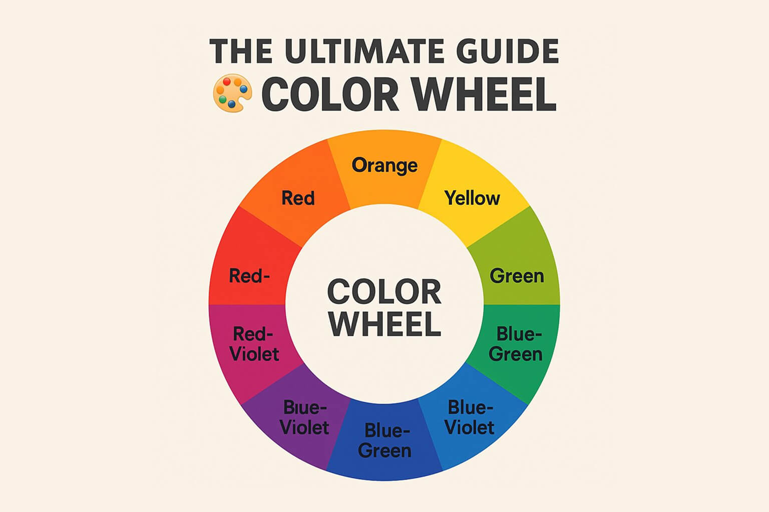
What Is the Color Wheel?
The color wheel is a circular diagram that organizes colors in a way that shows relationships between them. Originally developed by Sir Isaac Newton in the 17th century, the modern version includes primary, secondary, and tertiary colors, arranged in a continuous loop.
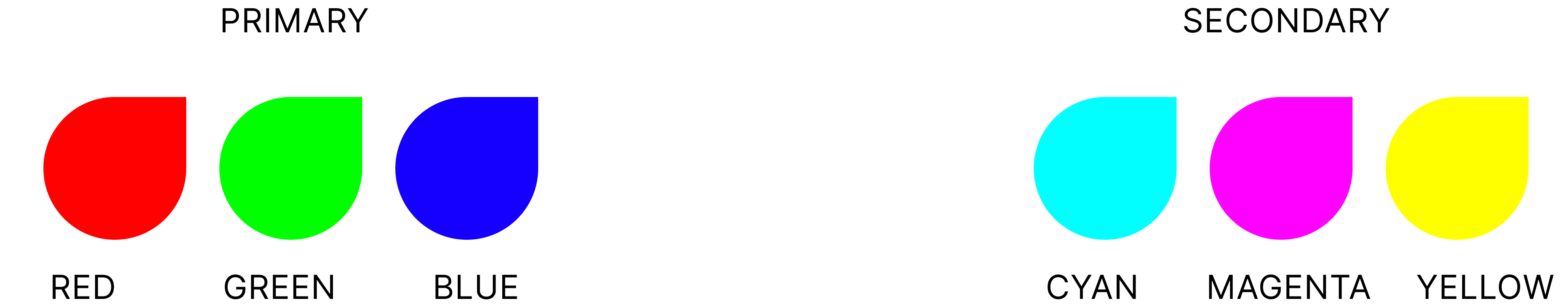
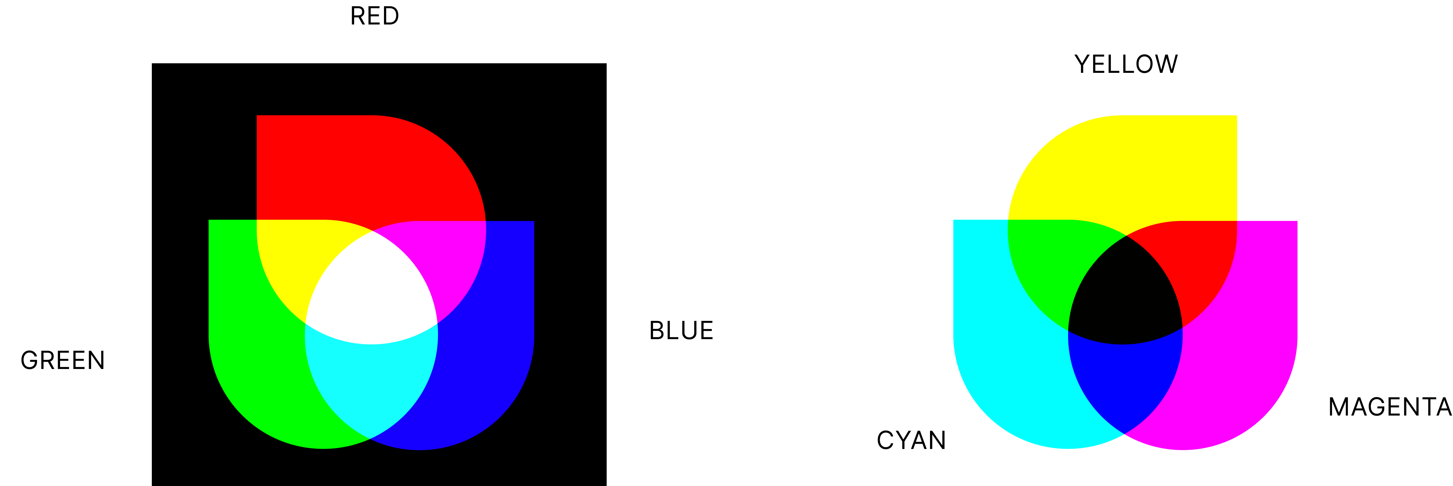
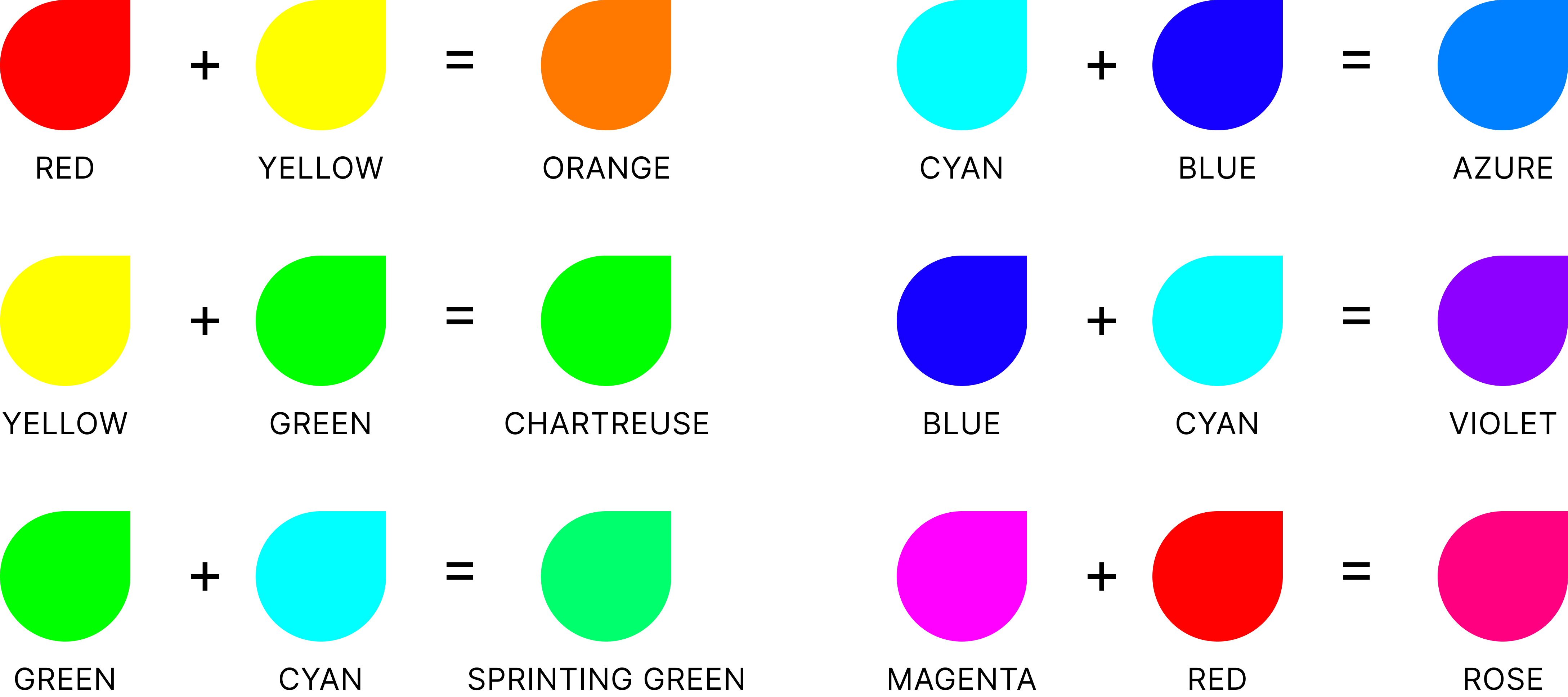
Primary Color
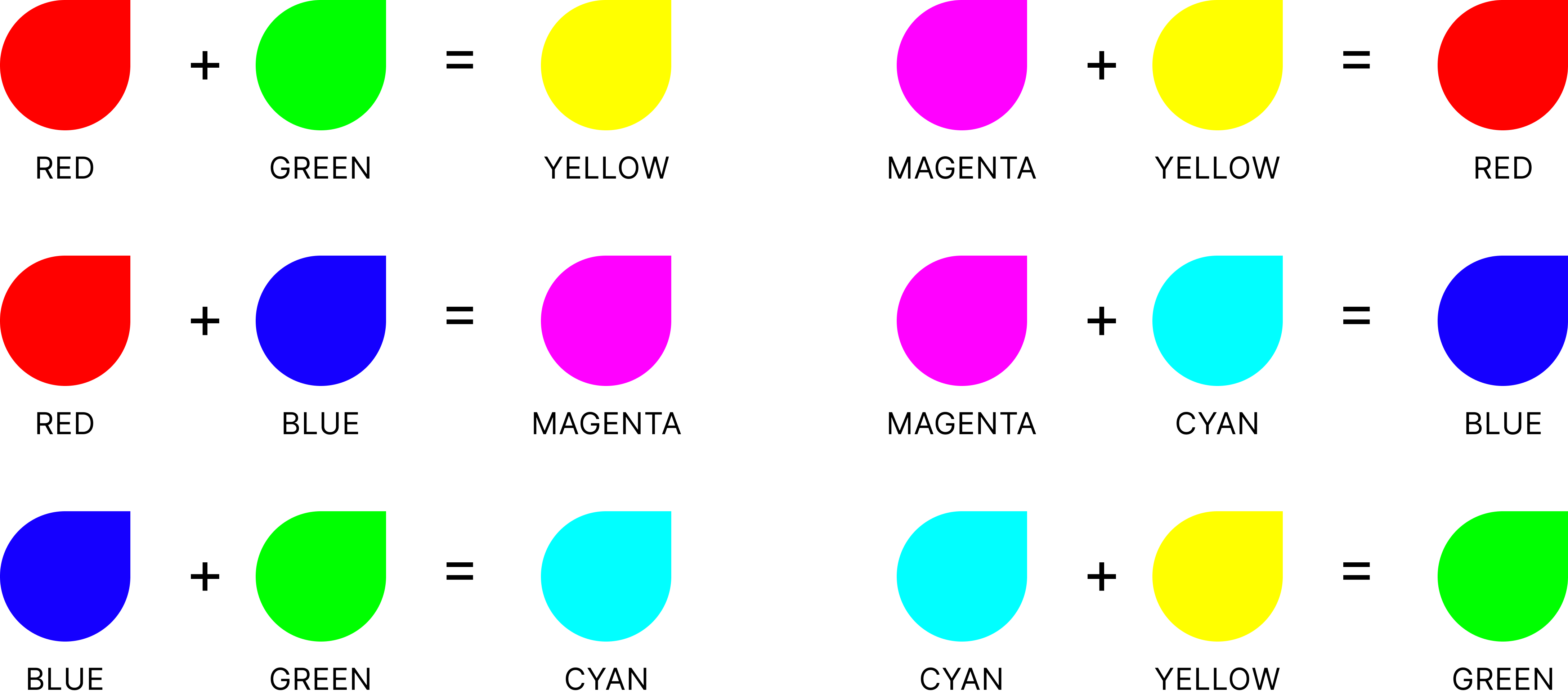
Red
Blue
Yellow
CYAN
MAGENTA
YELLOW
These are the building blocks. You can't create them by mixing other colors.
Secondary Color
These are created by mixing two primary colors.
Tertiary Colors
These are the result of mixing a primary color with a neighboring secondary color.
Why the Color Wheel Matters
Understanding the color wheel helps you:
Create color harmony
Evoke the right emotions
Improve UX through accessible contrast
Design cohesive brand identities
Avoid clashing color combinations
Whether you're selecting a color scheme for a website or painting a masterpiece, the color wheel is your secret weapon.
Types of Color Harmony (Based on the Color Wheel)
Here’s how designers use the wheel to craft pleasing combinations:
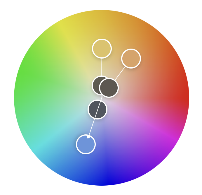
1. Complementary Colors
Colors opposite each other on the wheel, like blue and orange. They create strong contrast and visual interest.
2. Analogous Colors
Colors that sit side by side, like blue, blue-green, and green. These schemes are soothing and natural.
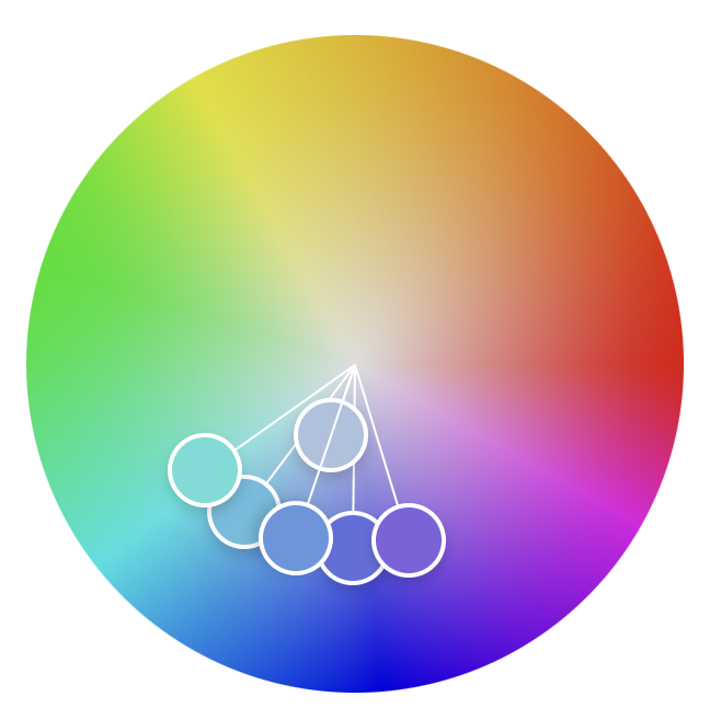
3. Triadic Colors
Three colors that are evenly spaced on the wheel, like red, yellow, and blue. They provide balance and vibrancy.
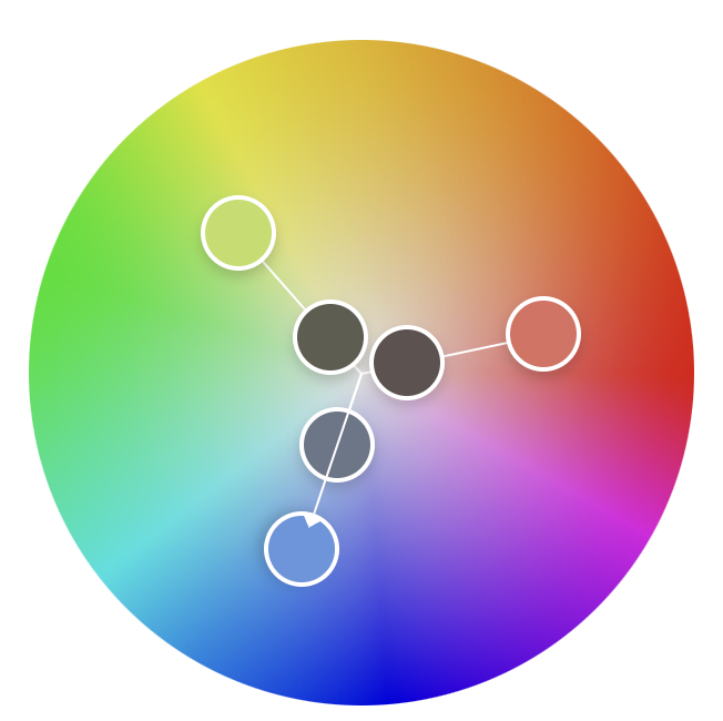
4. Split-Complementary
One base color plus two adjacent to its opposite. It’s a softer alternative to the complementary scheme.
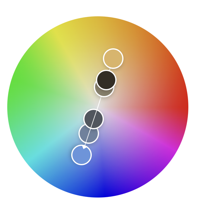
5. Monochromatic
Different shades and tints of a single color. Elegant and minimal, perfect for modern interfaces.
Tips for Using the Color Wheel in Design
Start with purpose: Are you creating energy (go warm)? Calmness (go cool)?
Consider accessibility: Use tools to check color contrast for readability.
Understanding the color wheel is like unlocking the secret language of design. It empowers you to make smart, strategic choices that elevate your work and resonate with your audience. Whether you're designing a logo, building an app UI, or painting your next canvas masterpiece, the color wheel is your trusted ally.
So next time you're stuck staring at a blank canvas or Figma file, give the wheel a spin—literally or metaphorically—and let color theory do its magic.
Not all agencies approach design the same way. Here's what to look for — and what to walk away from — when evaluating a UI UX design partner for your next build.
Most founders think they need a redesign. Half the time, a targeted UX audit and two weeks of fixes delivers the same result. Here's how to tell which one applies to you.
6 mins read
Stop Losing Users to Bad UX
Book your free strategy call. We'll show you exactly where your product is leaking conversions — and how to fix it.
30 min · No obligation · Actionable insights guaranteed
Hafiz Ibrahim
CXL Certified, NN/g UX Certified, 10+ years in product design


.svg)
.svg)