Your traffic is good, thanks to the ads you’re running.
And your product? Genuinely good as well.
Then why aren't people buying?
You changed the button and also the headline. Pushed the pricing section higher so that people can see that instantly.
But still there’s no change.
So, you do what every clueless team does - spending more on ads.
Simply put, you’re spending more budget on ads that are getting you more reach, when the problem wasn’t reach in the first place. It was not having a UX audit.
It would’ve told you that your users weren't unconvinced. They were confused. Because every time they showed up on your website, they looked around, didn’t find what they came for, and left.
And today, in this guide, we’re going to tell you how you can fix that from now on and never let the confusion show up again. All you have to do is keep scrolling.
What Is a UX Audit?
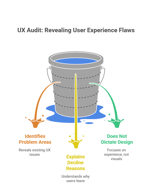
A UX audit is a planned review of your product or website that shows you where and why the user experience isn't working right. It's not a makeover. It's not a new name. This method helps you figure out what is stopping your users from doing what you want them to do.
It's kind of like a checkup for your product. You wouldn't start taking out parts without first figuring out what was wrong. You can find the problems with UX with an audit before you plan how to fix them.
Usually, a full audit looks at user paths, page layouts, navigation, content clarity, forms, mobile experience, accessibility, and technical performance. It uses heatmaps, session recordings, analytics tools, and expert review to get a full picture of where the friction is.
Its result is an ordered list of problems with clear suggestions, not a wish list of nice-to-haves. The best audits explain why the order of fixes is important and what to fix first.
Why a UX Audit Matters for Website Performance and Conversions
Most teams make the most of what they can see. Spending on ads, email read rates, and landing page copy. The stuff you can see. What shows up on screens and is talked about in Monday meetings.
The experience is what they don't optimize because it's hard for them to see. The moment a user lands, gets a little lost, and thinks in private that this isn't worth their time.
That part of the time costs you money. A UX audit makes you see it.
1. It stops you from fixing the wrong things
Changing the color of your call to action is not a plan. That's also not the point of A/B testing headlines when your checkout flow has three steps that aren't even needed. Once you run a UX audit, you don't have to guess where the real problem is, as you can see what needs to be fixed in the first place.
2. It connects design decisions to revenue
Bad UX isn't a matter of style. But it surely has a lot to do with business. Slow start times, hard-to-navigate pages, and forms that ask for too much information all hurt conversion rates. A UX analysis puts a number on that cost and makes the fixing impossible to ignore.
3. It gives everyone on your team a single source of truth
No more marketing that blames the product. Design and development should no longer be going in different ways. One of the benefits of UX audit is it shows proof, like real data and real user behavior, and helps everyone agree on what needs to change.
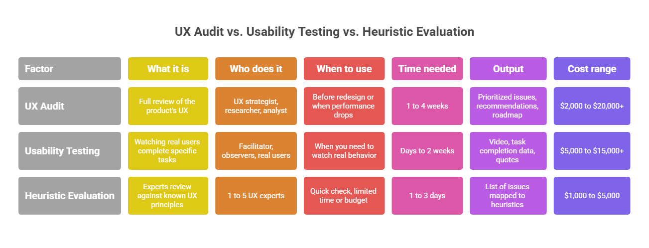
UX Audit vs Usability Testing vs Heuristic Evaluation
It's hard for teams to figure out what they need because these three terms are often used to mean the same thing. Though they are linked, they are not the same thing.
Factor
UX Audit
Usability Testing
Heuristic Evaluation
What it is
Full review of the product's UX across all touchpoints
Watching real users complete specific tasks
Experts review against known UX principles
Who does it
UX strategist, researcher, analyst
Facilitator, observers, real users
1 to 5 UX experts
When to use
Before redesign or when performance drops
When you need to watch real behavior
Quick check, limited time or budget
Time needed
1 to 4 weeks
Days to 2 weeks
1 to 3 days
Output
Prioritized issues, recommendations, roadmap
Video, task completion data, quotes
List of issues mapped to heuristics
Cost range
$2,000 to $20,000+
$5,000 to $15,000+
$1,000 to $5,000
The choice between UX audit vs usability testing usually comes down to how much time and money you have. Usability testing gives you more detailed information about how people behave, but you have to find people to participate and hold classes. Existing data can be used to speed up a UX audit and still produce useful results.
The fastest of the three is heuristic evaluation. It's helpful for finding clear problems quickly, but it depends on the opinion of experts instead of how real users act. It's a good addition to a full audit, but it's not the same thing.
When Should You Conduct a UX Audit?
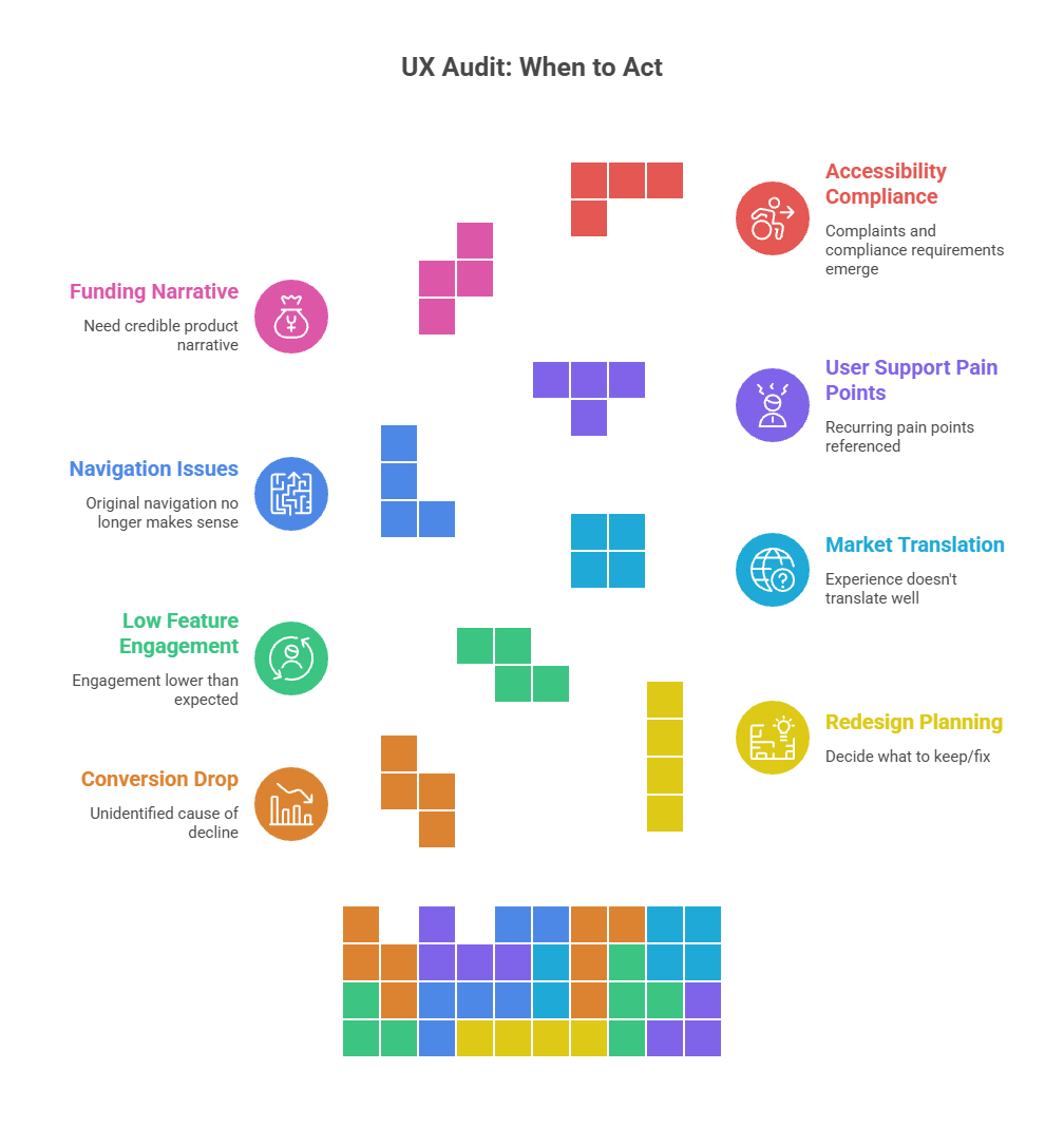
There isn't just one good time to do an audit. Sometimes, though, doing one turns into a necessity, not a choice. Clear signals that it is time for a when to do a UX audit when -
- You can't figure out why conversion rates have gone down.
- You want to know what to keep and what to fix for your redesigning.
- You added a new feature, but not as many people are using it as you thought they would.
- You're going into a new market, and what you already know won't work there.
- Your product has grown a lot, and the old system doesn't work anymore.
- Support calls from users keep bringing up the same issues
- You want to raise funding and need a convincing narrative of your product.
- There are more and more issues popping up about accessibility
A UX audit for a small business doesn't need to be as thorough as one for a large company. Simply checking out two or three important pages can reveal enough to really make a difference. No matter how big or small the company is, the goal of an ux audit is always the same: find the problems and fix them.
Types of UX Audit: Which One Does Your Product Need?
Not all audits look at the same things. You may need a different kind of audit depending on the issue you want to address. Now look at how they break down.
Contrast, keyboard nav, screen reader support, alt text
Content and IA Audit
Confusing navigation, high bounce rates
Menu structure, labeling, content hierarchy, search
Technical UX Audit
Slow pages, broken interactions
Core Web Vitals, load times, error states, broken elements
Who Should Be Involved in a UX Audit?
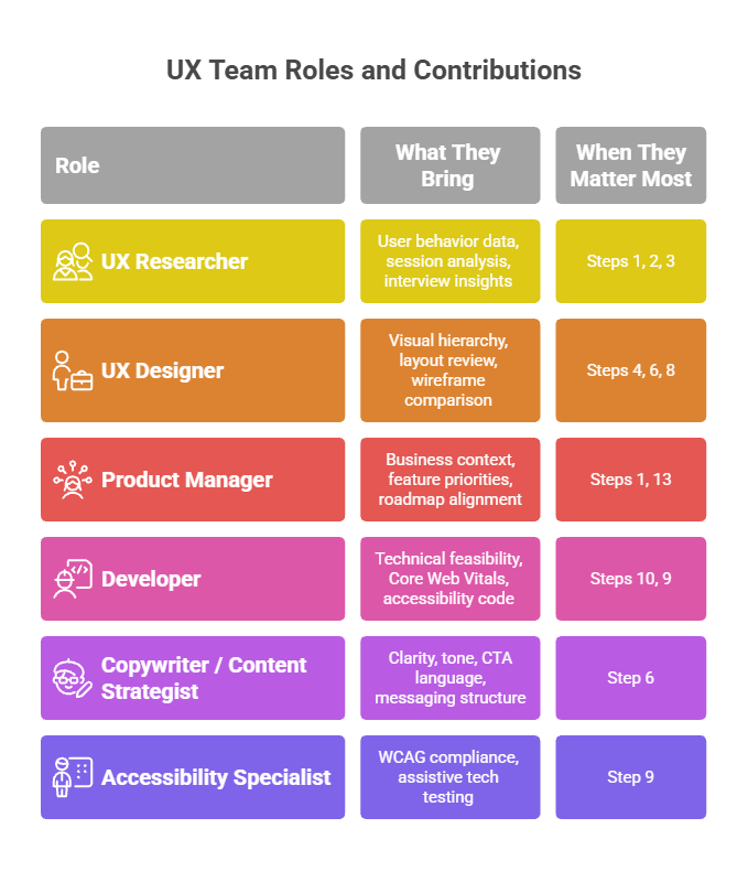
One of the most common UX audit mistakes is doing the audit by yourself. People, even very good UX designers, can make mistakes when they do an audit by themselves. Using a variety of views is key to the best audits.
Role
What They Bring
When They Matter Most
UX Researcher
User behavior data, session analysis, interview insights
Business context, feature priorities, roadmap alignment
Steps 1, 13
Developer
Technical feasibility, Core Web Vitals, accessibility code
Steps 10, 9
Copywriter / Content Strategist
Clarity, tone, CTA language, messaging structure
Step 6
Accessibility Specialist
WCAG compliance, assistive tech testing
Step 9
For a small business UX audit, one person might be in charge of a lot of these tasks. That's fine, as long as the work gets done everywhere. But when it comes to a complicated product or enterprise auditing, each role becomes more important on its own.
What Does a UX Audit Usually Cover?
UX audit scope changes based on the product and the objectives, but a full audit usually includes all of these areas:
User journey and task flow mapping
Heuristic evaluation against established UX principles
Navigation structure and information architecture
Page layout, visual hierarchy, and content clarity
Call-to-action placement, wording, and visibility
Form design, field count, and error handling
Mobile responsiveness and touch usability
Accessibility compliance against WCAG 2.1
Technical performance including Core Web Vitals
Competitive benchmarking against similar products
A more focused UX audit scope could look at only the checkout process or the onboarding process. A full audit looks at everything. It depends on what your biggest problems are and how much time you have to fix them.
The UX Audit Process: 11 Steps From Start to Finish
These steps make up the whole UX audit process that Ink Studio uses. Each step follows the last one. When audits skip steps, they come up with results that are technically right but practically useless.
Step 1: Define Business Goals and User Goals
Make sure you know two things before you get started with any analytics dashboard. What does the company need this product to do? Why would someone use it, and what do they need to do?
The UX audit goals are where these two questions meet. If the company wants to get more sample users and the user wants to know what the product does first, the audit should focus on the moments before the signup button shows up.
Note these down. Give them to everyone who is part of the audit. If there aren't any clear goals, an audit is just a list of opinions.
Step 2: Gather UX Data Before Auditing
Data first, opinions second. Find out as much as you can about how users are currently acting before anyone looks at a single screen. This is what makes an audit credible and not just a gut-feel practice.
Here's what you need for your UX analytics audit:
Google Analytics 4 or equivalent: bounce rates, exit pages, funnel drop-offs
Heatmaps: where users click, where they scroll to, what they ignore
Session recordings: watch real users navigate through key flows
Support tickets and live chat logs: find recurring complaints
Previous user research: interviews, surveys, usability test results
NPS scores and satisfaction data if available
Step 3: Map Core User Journeys and Task Flows
The paths people take through your product to finish important tasks are mapped out in a user journey audit. A user flow audit goes even further and writes down the exact steps that are needed to complete each job.
The point is to see the object through the eyes of someone who has never used it before. What do people who want to buy something do when they get to your home page? What happens when they try to change their phone's password? Make a plan for each step and write down any possible problems that might come up.
These maps are the basis for everything that comes after. As you go through the audit, you will keep coming back to them.
Step 4: Perform a Heuristic Evaluation
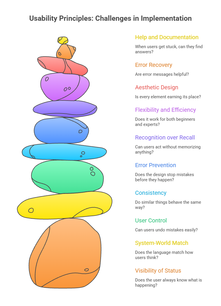
A "Heuristic evaluation UX audit" checks your product against Jakob Nielsen's ten usability principles. These rules are nothing made up on the spot. Decades of study have shown that these patterns have an effect on how well something works. The ten heuristics to evaluate against are -
Visibility of system status: Does the user always know what is happening?
Match between system and real world: Does the language match how users think?
User control and freedom: Can users undo mistakes easily?
Consistency and standards: Do similar things behave the same way?
Error prevention: Does the design stop mistakes before they happen?
Recognition over recall: Can users act without memorizing anything?
Flexibility and efficiency: Does it work for both beginners and experts?
Aesthetic and minimalist design: Is every element earning its place?
Help users recognize and recover from errors: Are error messages helpful?
Help and documentation: When users get stuck, can they find answers?
On a scale from 0 to 4, rate how bad each problem is. This helps you figure out what needs to be fixed first.
Step 5: Review Navigation and Information Architecture
A navigation UX audit checks to see if people can easily find what they need. A lot of navigation issues are brought on by signs that make sense to the business but not to the customer.
Use a tool like Optimal Workshop to do a card sort or tree test on your information design. Check out what five people do when you ask them to find something on your site. Within thirty minutes, you will learn more than you would from a week of private discussion.
Check how many clicks it takes to get to important pages, how consistent the labels are across the site, how well-structured the categories are, and whether the mobile navigation is as easy to use as the desktop version.
Step 6: Audit Page Layout, Content Clarity, and CTAs
A content UX audit checks to see if your pages are set up to get people to take action. A "CTA audit" checks to see if those specific calls to action are genuinely working.
Ask yourself, "Does a new visitor know what this page is about and what they should do next in 8 seconds?" for each key page. If the answer is no, the issue is with the style or the text.
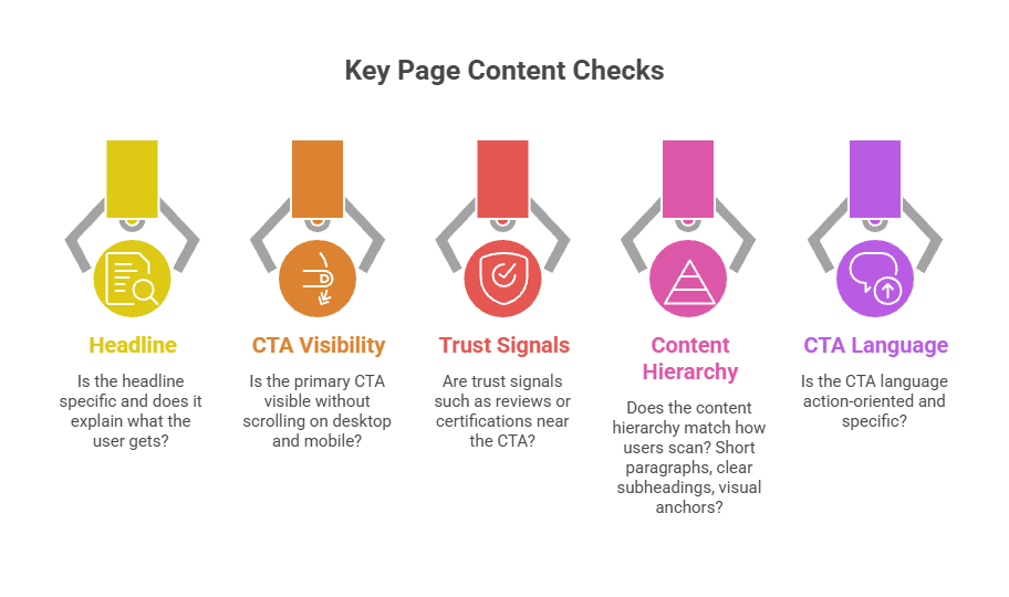
Things to check on every key page:
Is the headline specific and does it explain what the user gets?
Is the primary CTA visible without scrolling on desktop and mobile?
Are trust signals such as reviews or certifications near the CTA?
Does the content hierarchy match how users scan? Short paragraphs, clear subheadings, visual anchors?
Is the CTA language action-oriented and specific?
Step 7: Evaluate Forms, Checkout, or Onboarding Flows
It's common for businesses to lose the most money during form UX audits and checkout UX audits. Forms are where intent turns into action or doesn't. Every field that isn't needed, every error message that isn't clear, and every missed auto-fill hint costs you completions.
Studies show that cutting a form from six lines to three can increase the number of people who fill it out by two times. That's not a design point of view. That is a business result that can be measured.
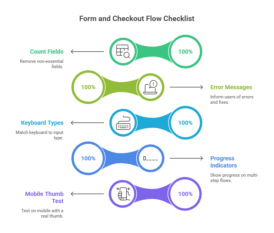
What to check in every form or checkout flow:
Count the fields. Remove anything that is not essential at this stage.
Check that error messages tell the user what went wrong and how to fix it.
Verify that keyboard types match the input (number keyboard for phone fields).
Check that progress indicators exist on multi-step flows.
Test the entire flow on mobile with a real thumb.
Step 8: Check Mobile UX and Responsive Design
A "mobile UX audit" doesn't check to see how well the page works on a phone. It's about whether the experience can be used on one. More than 60% of web traffic now comes from phones, but most product teams still plan with desktops in mind. So, here's what needs to be done.
Check touch targets: every tappable element should be at least 44 by 44 pixels
Verify there is no horizontal scrolling on any screen size. Test the navigation with one hand
Check the loading speed on a real phone on a real network.
Make sure that windows and pop-ups don't take up the whole screen on mobile devices.
Step 9: Review Accessibility and Inclusive Design
An accessibility UX audit checks to see if people who are visually impaired, have trouble moving or thinking, or who have hearing loss can use your product. This is not just a legal consideration but a product quality issue.
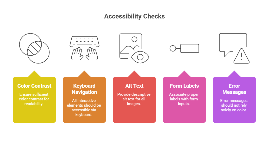
Most organizations try to reach WCAG 2.1 AA as a standard. First, use axe or WAVE to do automated testing to find the most obvious problems. Then, try keyboard navigation by hand and do a screen reader walkthrough.
Key accessibility checks:
Color contrast ratio of at least 4.5:1 for normal text
All interactive elements reachable by keyboard
All images have descriptive alt text
Forms have proper labels associated with inputs
Error messages are not communicated by color alone
Step 10: Analyze Site Speed and Technical UX Issues
A technical UX audit examines the part of the performance that users don't see but always feel. No matter how well it's designed, a page that takes 6 seconds to load on a phone is a bad experience for the user.
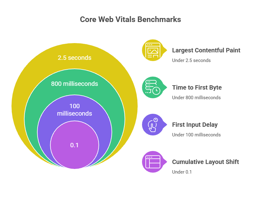
Core Web Vitals benchmarks to check:
Largest Contentful Paint (LCP): should be under 2.5 seconds
First Input Delay (FID): should be under 100 milliseconds
Cumulative Layout Shift (CLS): should be under 0.1
Time to First Byte (TTFB): should be under 800 milliseconds
PageSpeed Insights and Chrome DevTools can help you find the largest files, scripts that slow down rendering, and layout problems that make the page unstable. These are technical issues that can be fixed, and they have a direct effect on how users feel and how many results they get in search engines.
Step 11: Benchmark Against Competitors
A competitor ux analysis puts your product in context. You are not just competing against an ideal version of your own product. You are competing against every other product your users have used before.
Pick three to five direct competitors and run a structured review of their key flows. Note where they handle things better than you do, where they have the same problems, and where you have a genuine advantage. This gives your audit findings a frame of reference that makes prioritization much easier.
How to Prioritize UX Audit Findings
Based on the product, a thorough audit can find 30, 50, or even 100 problems. When you try to fix everything at once, nothing gets fixed. How you prioritize UX issues depends on two things: how much does the problem cost, and how hard is it to fix?
Figure: UX Issue Priority Framework
Issue
Impact
Effort
Priority
Checkout form has 12 fields
High
Low
Fix immediately
No mobile menu on product page
High
Medium
Fix this sprint
CTA above the fold is unclear
High
Low
Fix immediately
Blog lacks internal links
Medium
Low
Schedule soon
Footer navigation is cluttered
Low
Medium
Backlog
Brand color fails contrast ratio
High
High
Plan carefully
Present your findings to stakeholders with this framework visible. It is easier to get people to agree on the fixes that need to be made because the thinking is clear and based on business results instead of design preferences.
Common UX Problems Found During an Audit
No matter the business or type of product, some problems show up in almost all audits. In general, these are the ones that hurt sales the most.
Figure 5: Common UX Issues and Their Business Impact
Common UX Issue
Why It Hurts Conversions
Unclear or buried CTA
People are stuck and don't know what to do next. Every second of confusion makes people more likely to leave.
Too many form fields
Each new field makes it harder to finish the form. It has been shown that 3-field forms turn up to 160% better than 6-field forms.
Slow page load on mobile
If a page takes more than 3 seconds to load, 53% of mobile users will leave. Each second is important.
No trust signals near the CTA
When users are asked to do something and can't see a review, badge, or reassurance next to it, they might not do it.
Inconsistent navigation labels
People think they are in the wrong place if your page and menu both say different things.
Poor error messaging on forms
Users leave when they see vague mistakes like "invalid input." Some mistakes keep them from finishing out the form.
No clear value in the hero section
People stay for 8 seconds and then decide if they want to stay or not. They're gone if the hero doesn't tell what you do and why it matters.
Desktop-only design thinking
Navigation, CTAs, and forms built for mouse users fall apart on a touchscreen. More than 60% of web traffic comes from mobile devices.
UX Audit Checklist You Can Use
This UX audit checklist covers the most important areas across a full product audit. Use it as a starting point and add items that are specific to your product type.
Category
Checklist Items
Business and User Goals
Business goals and KPIs documented
User goals and pain points identified
Audit scope agreed by all stakeholders
Success metrics defined before starting
User Journey and Flow
Core user journeys mapped end to end
Task flows documented for key actions
Drop-off points identified in analytics
Entry points from ads/search reviewed
Heuristic Evaluation
10 Nielsen heuristics applied
Issues logged with severity rating
Screenshots captured for each finding
Compared against competitor patterns
Navigation and IA
Menu labels tested with real users or card sort
Information hierarchy reviewed
Breadcrumbs and wayfinding checked
Search functionality tested
Content and CTAs
Value proposition clear in hero section
CTA language tested for clarity
Trust signals near key CTAs
Content hierarchy supports scanning
Forms and Checkout
Field count minimized
Error messages are specific and helpful
Progress indicators on multi-step flows
Auto-fill and mobile keyboard types enabled
Mobile UX
All touch targets minimum 44x44px
No horizontal scrolling on any screen
Load time under 3 seconds on 4G
Mobile navigation usable with one thumb
Accessibility
Color contrast meets WCAG AA
Keyboard navigation tested
Screen reader compatibility checked
Alt text on all meaningful images
Technical UX
Core Web Vitals passing in PageSpeed Insights
No broken links or error states
Largest Contentful Paint under 2.5s
Cumulative Layout Shift under 0.1
Best UX Audit Tools for Research and Analysis
The UX audit tools you use tell you how good the data is that you're working with. Opinions are cheap, but we can't say the same thing about the 80% of users who never scroll below the hero section.
When it comes to UX audit tools vs. experts, tools give you data, while experts tell you what that data means. Both are important. A graph shows you where people stopped scrolling. A UX professional can tell you what to do and why that is important.
Figure: UX Audit and Accessibility Testing Tools
Tool
Category
What It Does for Your Audit
Hotjar
Heatmaps + recordings
Shows where users click, scroll, and abandon pages
FullStory
Session recording
Full session replays, rage clicks, error tracking
Google Analytics 4
Behavior analytics
Traffic flows, bounce rates, conversion funnels
Maze
Usability testing
Unmoderated task testing with real users
Optimal Workshop
IA and navigation
Card sorting, tree testing, navigation research
Figma
Design comparison
Side-by-side wireframe vs live page review
PageSpeed Insights
Technical UX
Core Web Vitals, load time, mobile performance
axe DevTools
Accessibility
Automated accessibility scanning against WCAG
WAVE
Accessibility
Visual accessibility annotations for any live page
Lookback
User research
Live and async user interview and testing sessions
How Much Does a UX Audit Cost?
The UX audit cost depends on a lot of things, like the size of the audit, how complicated the product is, and who does the work. Here is a more realistic breakdown.
Figure: UX Audit Cost by Type and Provider
Audit Type
In-House
Freelancer
Agency
Basic UX Audit
Staff time only
$500 to $2,000
$2,000 to $6,000
Full UX Audit
Staff time + tools
$2,000 to $5,000
$5,000 to $15,000
Ecommerce Audit
Staff time + tools
$2,500 to $6,000
$6,000 to $20,000
Enterprise / Complex Product
Internal team + tools
$5,000 to $10,000
$15,000 to $50,000+
UX audit timeline usually takes between one week and four weeks, depending on how in-depth the audit is. Allow time for collecting data, analyzing it, writing reports, and giving the show to stakeholders. When an audit is rushed, the results are hard to use.
In-House UX Audit vs Hiring an Agency
Both of these methods work. Your means and what you need from the audit will determine which option is best for you.
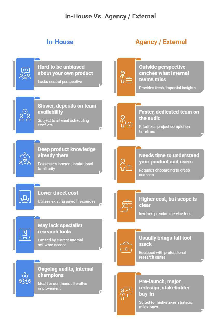
Factor
In-House
Agency / External
Objectivity
Hard to be unbiased about your own product
Outside perspective catches what internal teams miss
Speed
Slower, depends on team availability
Faster, dedicated team on the audit
Context
Deep product knowledge already there
Needs time to understand your product and users
Cost
Lower direct cost
Higher cost, but scope is clear
Tools
May lack specialist research tools
Usually brings full tool stack
Best for
Ongoing audits, internal champions
Pre-launch, major redesign, stakeholder buy-in
A UX audit agency can give you an outside view, which is often the best thing you can buy. It's really hard to see something through the eyes of a first-time user after your team has made it. Outside inspectors don't have that kind of bias.
It's best for teams that already know a lot about UX and want to make an ongoing audit part of their product process to do a in-house UX audit. It's important to be organized and honest about what you find, even if it makes you feel bad.
Mistakes to Avoid During a UX Audit
Common mistakes in UX audits usually follow the same trends. Prior knowledge of them helps you avoid wasting time and getting angry.
Starting without clear UX audit goals. Answers to questions that weren't asked lead to audits that don't have clear questions.
NOT using facts but instead opinions. There should be a link between every finding and something that can be seen in user behavior or data.
Checking everything at once without deciding what to focus on first. There is too much information, and nothing is put into action.
Forgetting to quickly engage the development team. Findings that can't be put into practice properly are useless.
Not thinking about the audit as a regular thing. Products are always changing. People's needs change. Performing an audit just once and not again quickly becomes outdated.
Showing results without making suggestions. Complaints are not audits; a list of problems with no offered solutions is a complaint.
Skipping mobile. Tracking data will show you what portion of people are on mobile. For those numbers above 40%, mobile should be given the same amount of care as desktop, not just as an afterthought.
Questions Worth Asking Before, During, and After a UX Audit
What do you do after the audit is complete?
The results of a UX audit are put into a UX audit report, which lists the suggestions in order of importance. The next step is for product, design, and development to get together and agree on what will be in the next sprint and what will be on the plan. Without this meeting, audit results would likely just sit in a document and lose their value over time. The audit is only useful if it leads to something.
Should a UX audit follow a fixed template?
An UX audit template can help you get started, but you shouldn't always stick to it. There are different problems, types of users, and business goals for each offering. With templates, you won't forget anything important. You shouldn't be stopped from going deeper in places that are clearly giving you trouble. The template is like the floor, not the roof.
How do you know if the audit findings are actually being used?
Keep track of the metrics that weren't working well before the audit, and check them again 4 to 8 weeks after the changes are made live. The most helpful ones are the exit rate, the bounce rate, the form completion rate, and the task success rate. It's important to use a "ux audit case study" that connects its findings to real-world results that can be measured, not just changes that make the design look better.
Can you run a useful audit with limited time and budget?
Yes. A focused audit on two or three pages with a lot of traffic or high drop-off can give you more useful information than a broad audit that only briefly looks at everything. Set clear goals for your ux audit, collect the data you already have, and quickly check the most important flows. Even a focused study that lasts four hours can find problems that need to be fixed right away.
How do you get stakeholder buy-in for the findings?
Show revenue impact wherever you can. A finding that says the checkout form has too many fields is a design opinion. A finding that says reducing form fields from 8 to 4 could increase completion rates by 30%, based on industry data and your current conversion numbers, is a business case. Frame every significant finding in terms of what it costs to leave unfixed, not just what it looks like.
What is the difference between a UX audit and a CRO audit?
Show how it affects income whenever you can. People who think the checkout form has too many fields are giving their design opinion. Based on data from the industry and your current conversion rates, a business case says that cutting the number of form fields from 8 to 4 could boost finish rates by 30%. Think about every important finding in terms of how much it costs to not fix it, not just how it looks.
How often should a product run a UX audit?
A CRO audit is usually more focused on one thing at a time: improving conversion rates. A UX audit looks at the whole experience, including parts that affect trust, happiness, retention, and even conversion. In real life, the two are very similar. Conversion research is often part of a UX audit. Accessibility, information design, and onboarding flow review are some of the UX tests that aren't always part of a CRO audit.
Final Words
A UX audit is not something that only big product teams with lots of money can do. No matter how big or small the product team is, this is one of the most profitable things they can do.
The products that keep getting better aren't always the ones whose designers are the best. They are the ones whose teams are honest about what they see, fix what needs fixing, and do it all over again. An investigation shows you the proof. You decide what to do with it.
Never guess what to do if you have a product that doesn't work the way it should. Do the check. Get to the bottom of things. Sort them by how much they hurt. After six months, do it again.
A lot of the time, there isn't as much difference between a product that people like and a product that they hate. That gap is easy to see with a good UX audit.
Impressions and downloads are vanity metrics. These six UX indicators are the ones that actually tell you whether your product is working — and where it's quietly losing users.
6 mins read
Stop Losing Users to Bad UX
Book your free strategy call. We'll show you exactly where your product is leaking conversions — and how to fix it.
30 min · No obligation · Actionable insights guaranteed
Hafiz Ibrahim
CXL Certified, NN/g UX Certified, 10+ years in product design







.svg)
.svg)